Background
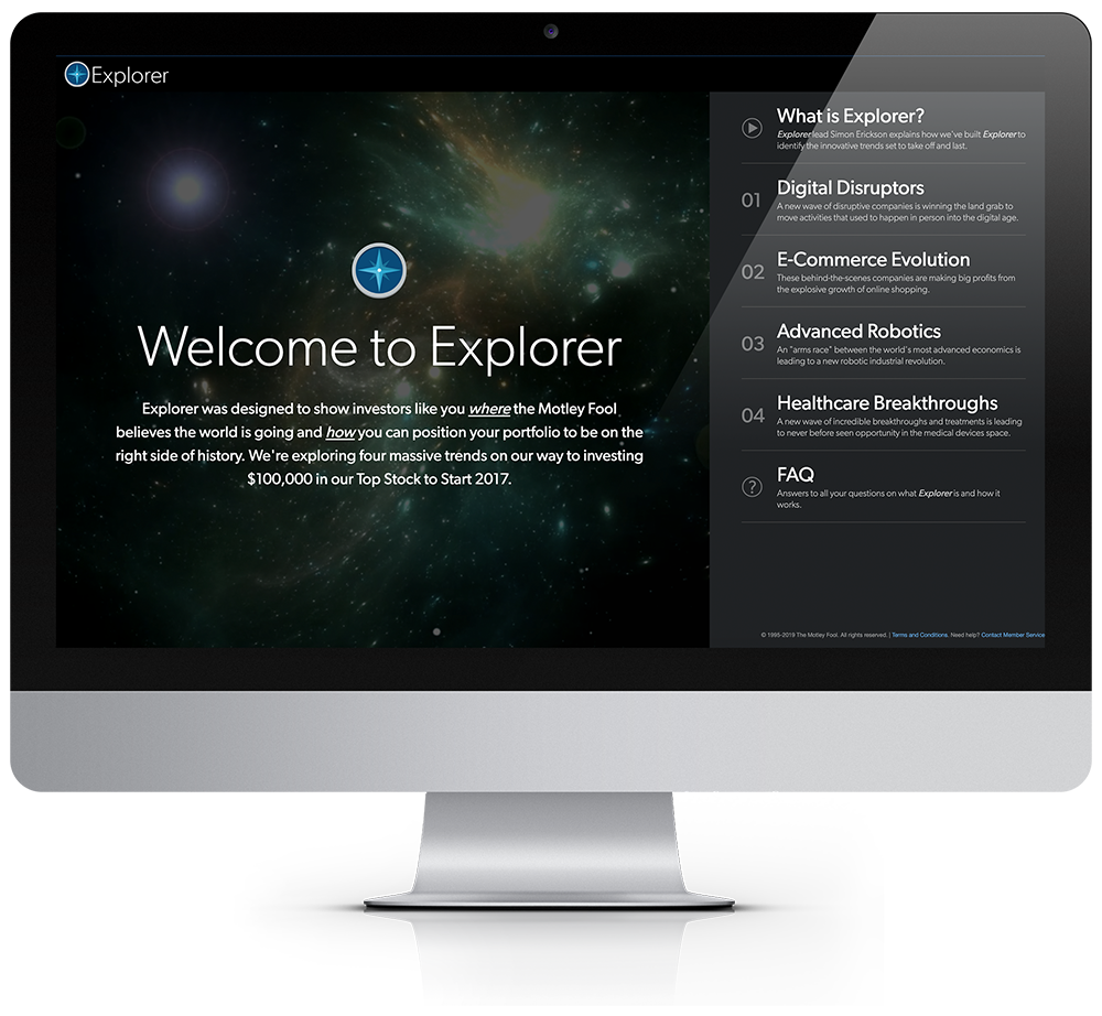
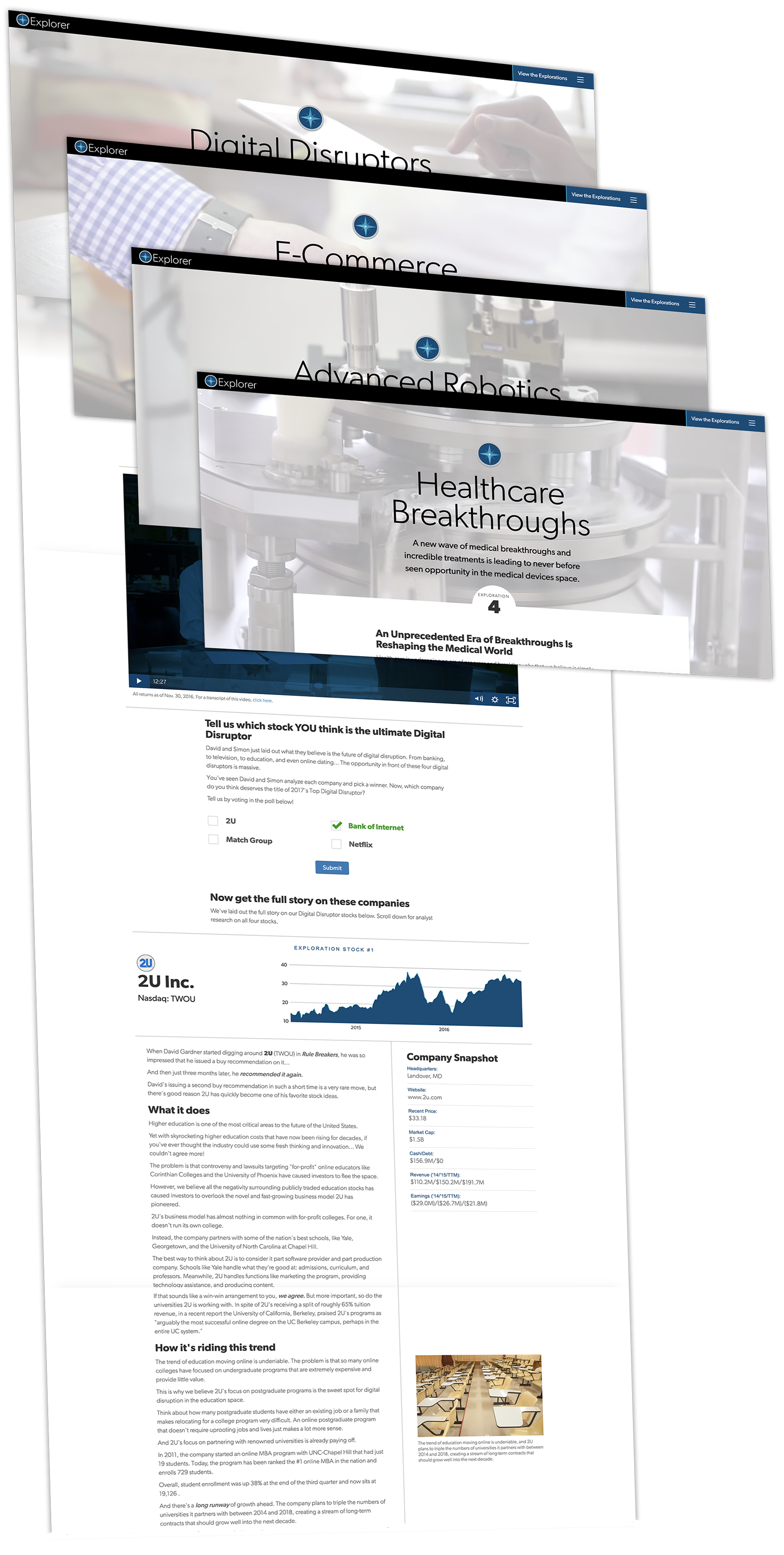
Motley Fool Supernova was such a massive success over the past few years... the returns, the portfolios, the content, etc. One of the most popular parts of the service was called "Explorer" — where the team selects a major trend every month and identifies the companies that stand to profit. We asked ourselves, "hey, why don't we turn Explorer into its own service?" So, that's what we did. For the inaugural launch of this service, we created a bracket-style campaign where we'd feature four different trends, each showcasing four stocks that the analysts are excited about. The group would vote for their favorite stock in each trend and then the four winners would be voted on once you joined the service, with the ultimate winner being crowned the Top Stock for 2017.

Branding
What says "explorer" more than a compass, amirite? So, as you can see, I went with the compass for the logo. Early versions looked a little too much like the Safari logo... so I made enough subtile tweaks to where we could call it our own. I used one of my favorite fonts of all time — Gibson — for the type treatment. Nice and clean.
Results
We created quite a buzz with the launch of this product. After just a couple of weeks, we generated a record hotlist of internal names. With a built-in soft close and two weeks of mailing, we cleared our revenue targets.